Jevitty, Longevity Health App
 Canada · Product design
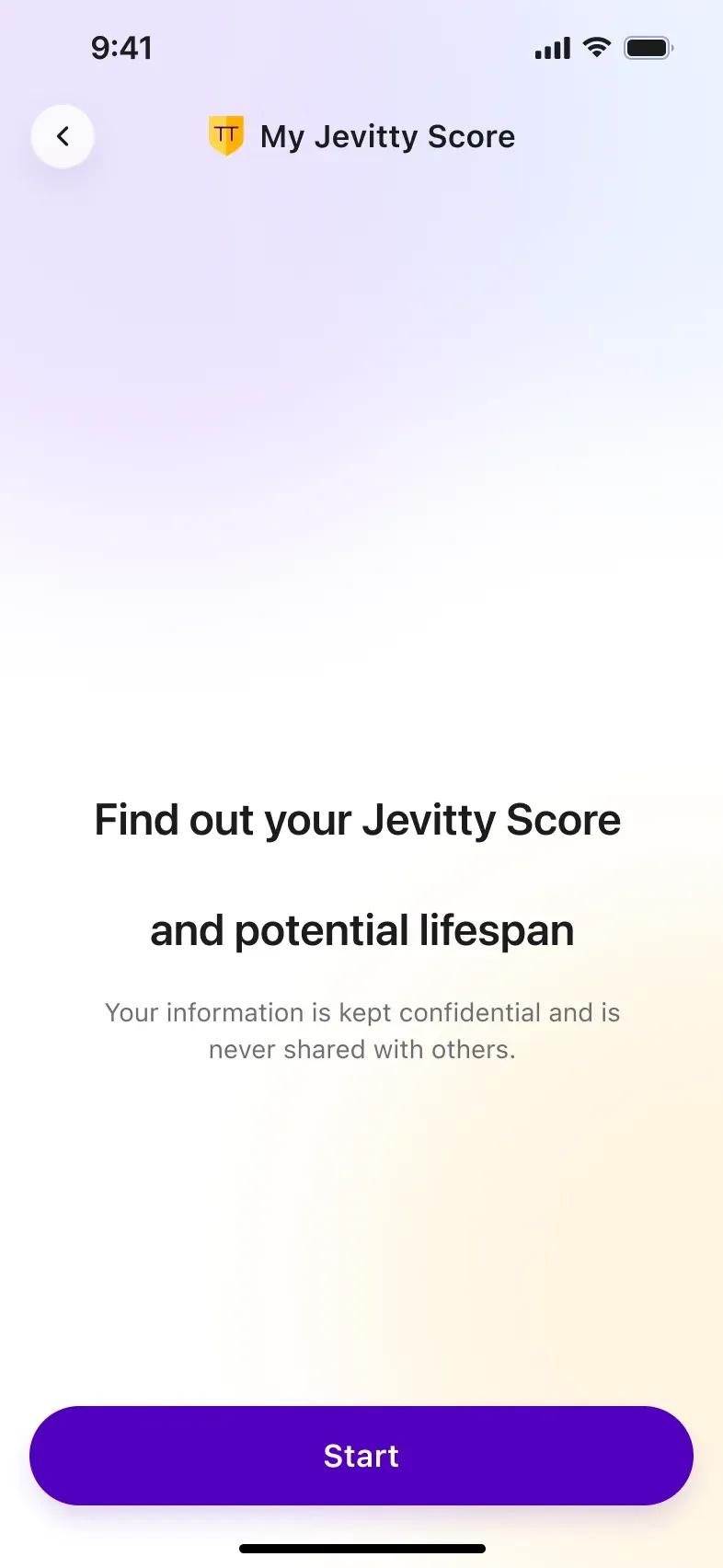
Jevitty Life Science Corp. is a Vancouver health‑tech company on a bold mission: help people add healthy years to their lives. Its app turns lifestyle answers, wearable data and medical body‑composition scans into one personal longevity number: the Jevitty Score.
I joined the project through Pieoneers, a Vancouver product studio, as the senior product designer. Over eight phases I took the product from discovery workshops and the first flowcharts to the brand identity, the iOS, Android and web apps, the design system and the marketing website.
 Figma
 Miro
 UserTesting
 VO2 Max42.04 / 31+
 Steps11,640 / 7,000+
- Role
- Senior Product Designervia Pieoneers
- Client
- Jevitty Life Science Corp.Vancouver, Canada
- Platforms
- iOS · Android · WebMarketing website
- My scope
- Discovery, UX/UI, branding,design system
The Challenge: Making Longevity Tangible
Health apps compete for attention with dozens of numbers, and Jevitty also had to handle sensitive medical data. Pieoneers framed three challenges; as the designer, I owned the experience side of each:
- A unique value proposition: making longevity tangible enough to stand out in a crowded health market, and building a brand that carries the company’s mission.
- A seamless experience: wearables, Apple Health, a lifestyle algorithm and medical imaging behind one simple interface.
- Scale and security: one consistent product across iOS, Android and web that keeps health data private.
 102.280YEARS
Eight Phases, One Designer’s Thread
The project moved through eight phases, from idea to production. I stayed on it end to end, which kept the product, brand and design system consistent from the first workshop to the native apps.
- 01DiscoveryProduct strategy, feature priorities, competitive analysis and the first flowcharts.
- 02UX workshopsCo‑design sessions with the founders and the first interface and prototype screens.
- 03BrandingLogo, imagery, typography and colour, captured in a brand style guide.
- 04PrototypeWireframes and hi‑fi screens for the React Native prototype with Apple Health sync.
- 05WebsiteHome, about, download and investor pages on Contentful, plus social templates.
- 06RebrandA refined shield logo, typography and brand elements with the founders.
- 07Native appsUI and design system for iOS (SwiftUI), Android (Kotlin) and the web app.
- 08Medical imagingBodycomp.ca report access and scan‑to‑scan comparison.
Mapping the Longevity Journey
Before any pixels, we ran discovery and UX workshops with the founders to prioritise features and turn the concept into a flowchart. The result was a five‑stage journey that moves a new user from curiosity to a daily habit in a few minutes.
- 01Onboarding
- Welcome & story
- Sign up
- Email verification
- Phone number
- 02Jevitty Score
- Gender & age
- Location
- Annual income
- Education
- Lifestyle × 12
- Healthcare plan
- 03Health data
- Apple Health
- Wearables
- Bodycomp scans
- Subscription
- 04Today
- Jevitty Score
- Daily goals
- Body metrics
- Notifications
- 05Explore
- Bodycomp reports
- News & articles
- Marketplace
- Profile
- Core daily loop
- Supporting flows
Brand Foundation: A Shield for Your Future Self
Branding ran alongside UX. Together with the founders we defined the logo, imagery, typography and colour, and later refined them in a dedicated rebrand phase. The shield stands for protection and a long life; violet and gold give the product a premium feel without looking clinical.
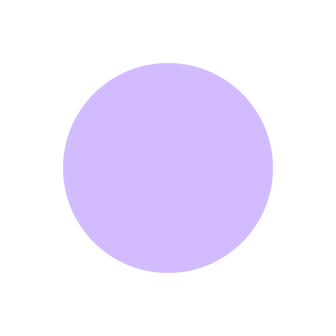




Add years to your life, add life to your years.
Colour
Primary
- Violet 900 #2A0A6B
- Violet 600 #5B1FE0
- Violet 300 #B18CFF
Accent
- Gold 500 #FFB200
- Gold 300 #FFD54A
Neutral
- Mist 900 #1C1C1E
- Mist 500 #8E8E93
- Mist 50 #F2F2F7
Type
- Large Title34 / Bold
- Title22 / Bold
- Body17 / Regular
- Caption13 / Medium
The Circle: One Shape for a Long Life
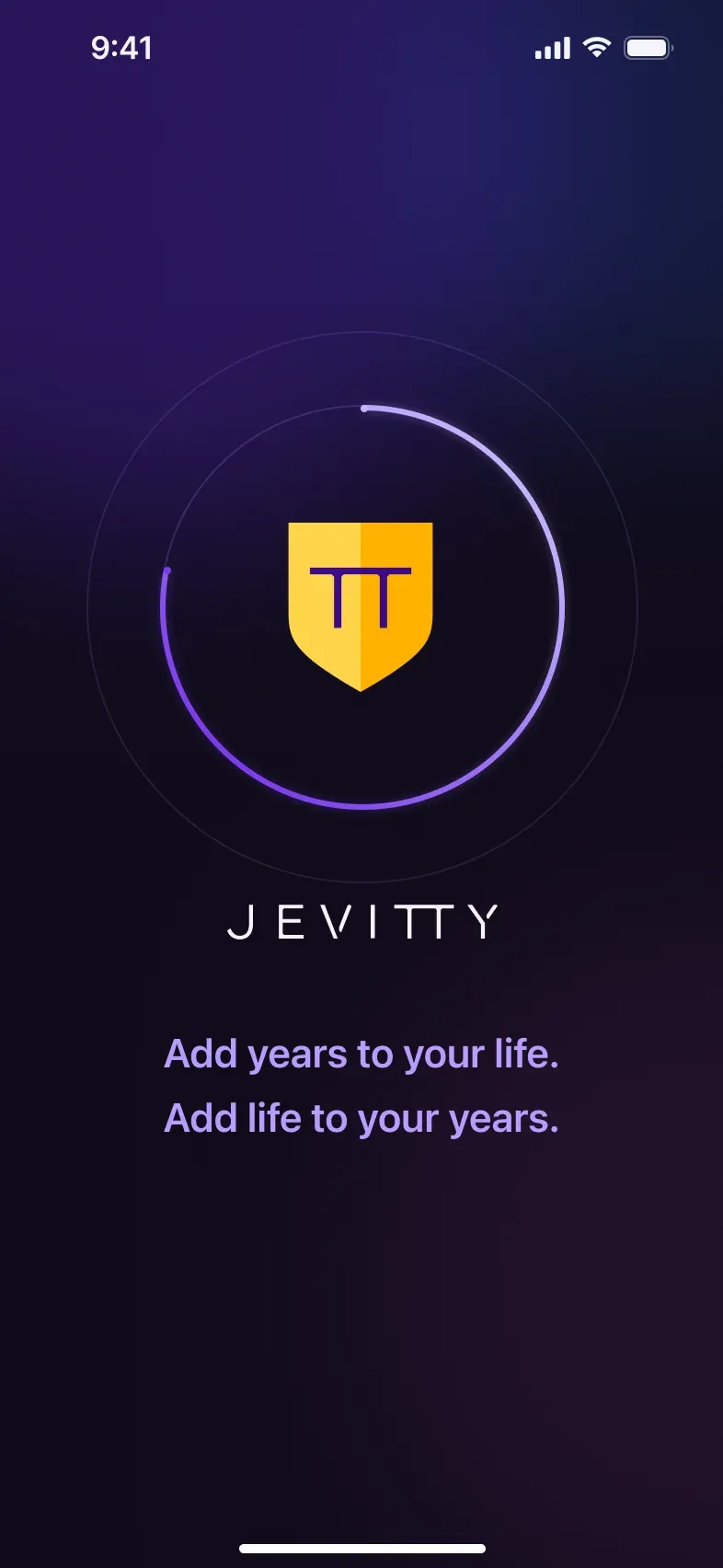
The circle comes from the original Jevitty 2.0 design and is the backbone of the product. A ring reads as a life cycle and as progress at the same time, so in the refresh I kept the circle and its behaviour exactly as they were.
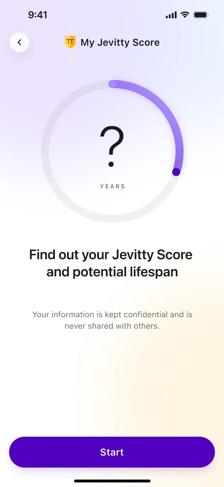
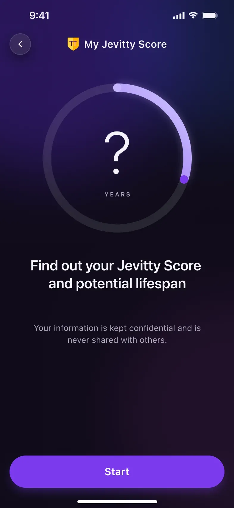
- Before you startStarts empty, as a question
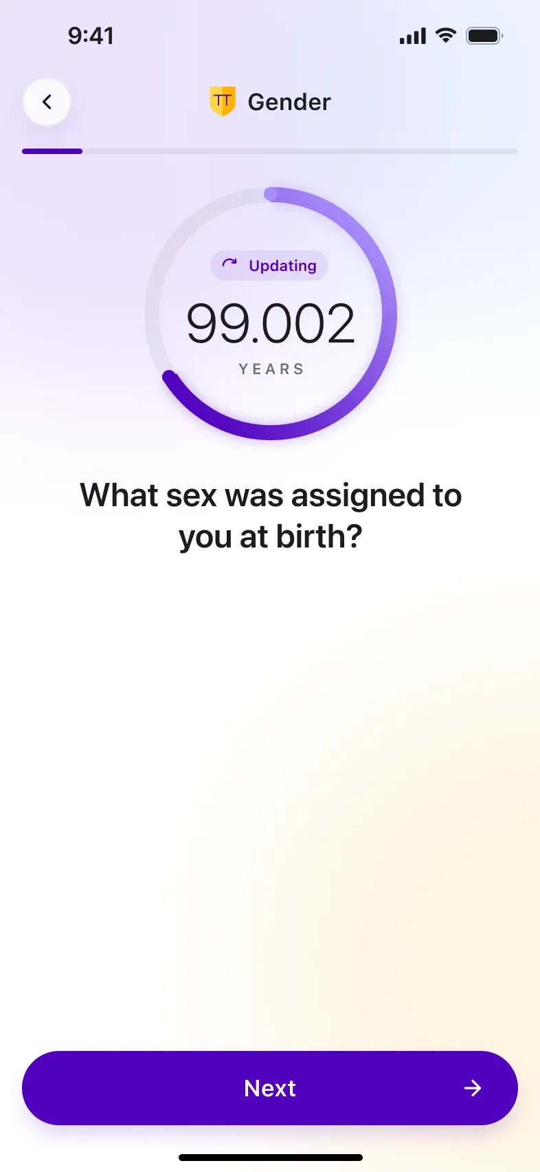
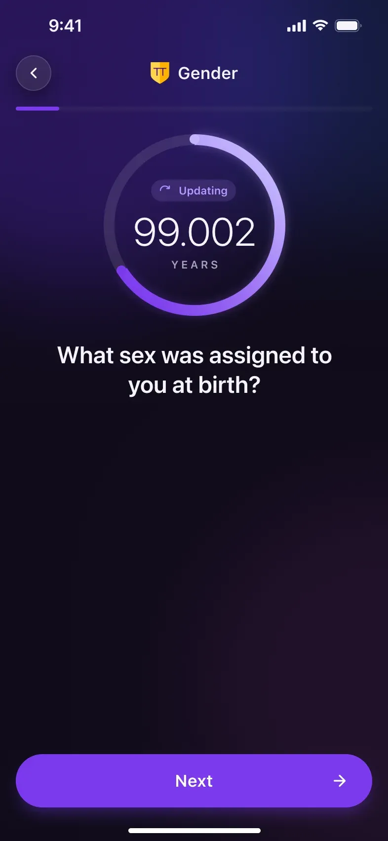
- While you answerFills up live with every answer
- Every dayBecomes the daily Jevitty Score
- Every metricRepeats for every health metric
Onboarding: From a Promise to a Number
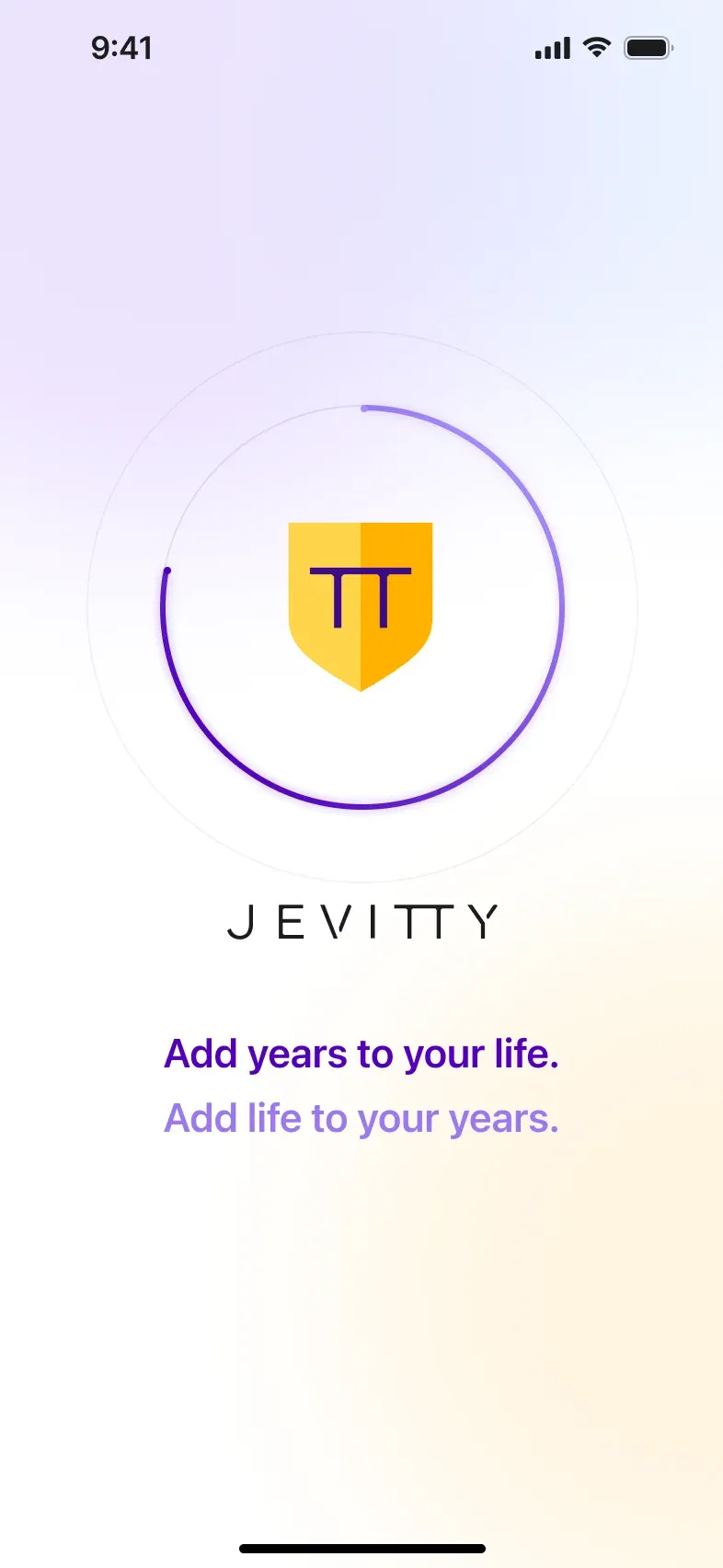
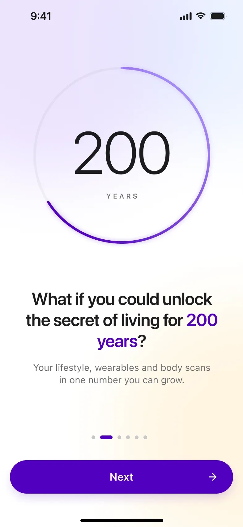
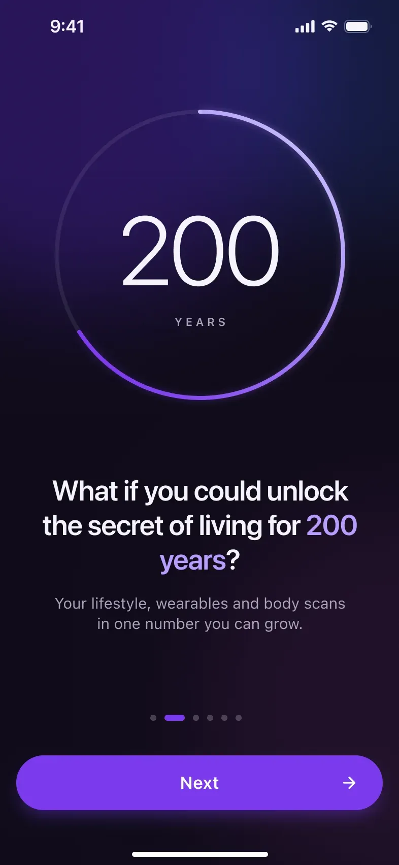
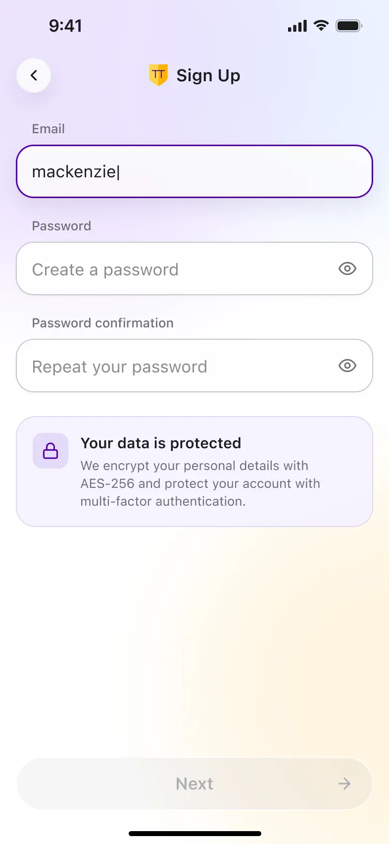
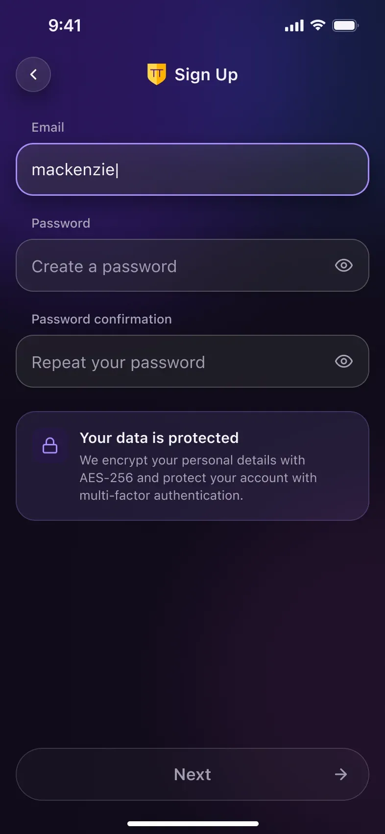
The flow is the same as in the original app. The refresh keeps every step and simplifies the surface:
- Story slides set the goal before asking for any data.
- Sign up explains privacy right where personal data is asked.
- Frosted glass surfaces on a clean white background replace the heavy purple bar.
The Jevitty Score Questionnaire
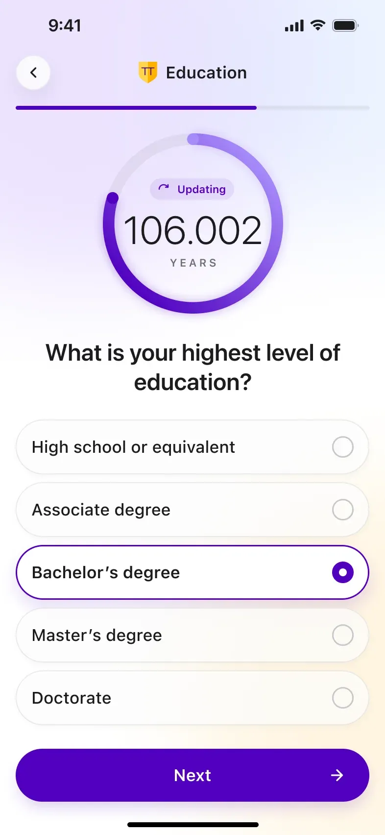
Twelve steps about lifestyle, income, education and health. The live circle under each question makes the form feel like feedback, not paperwork:
- The empty ring with a question mark starts the journey.
- Each answer moves the projected lifespan in real time.
- Large, full‑width options with a clear selected state replace the thin outlined buttons.

Dashboard: The Score and Eight Metrics
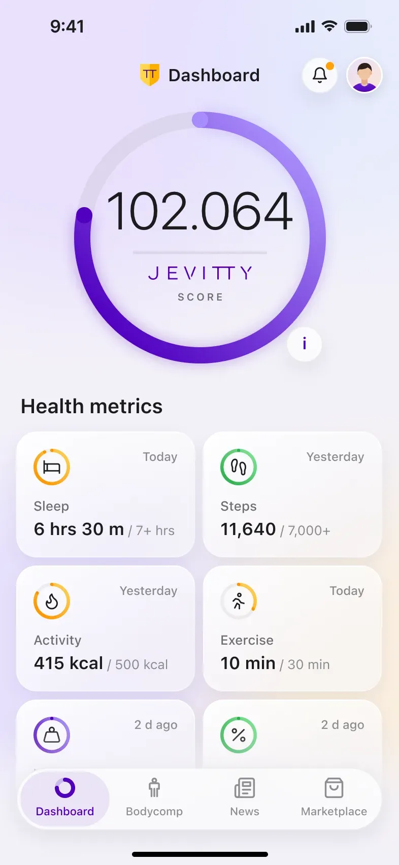
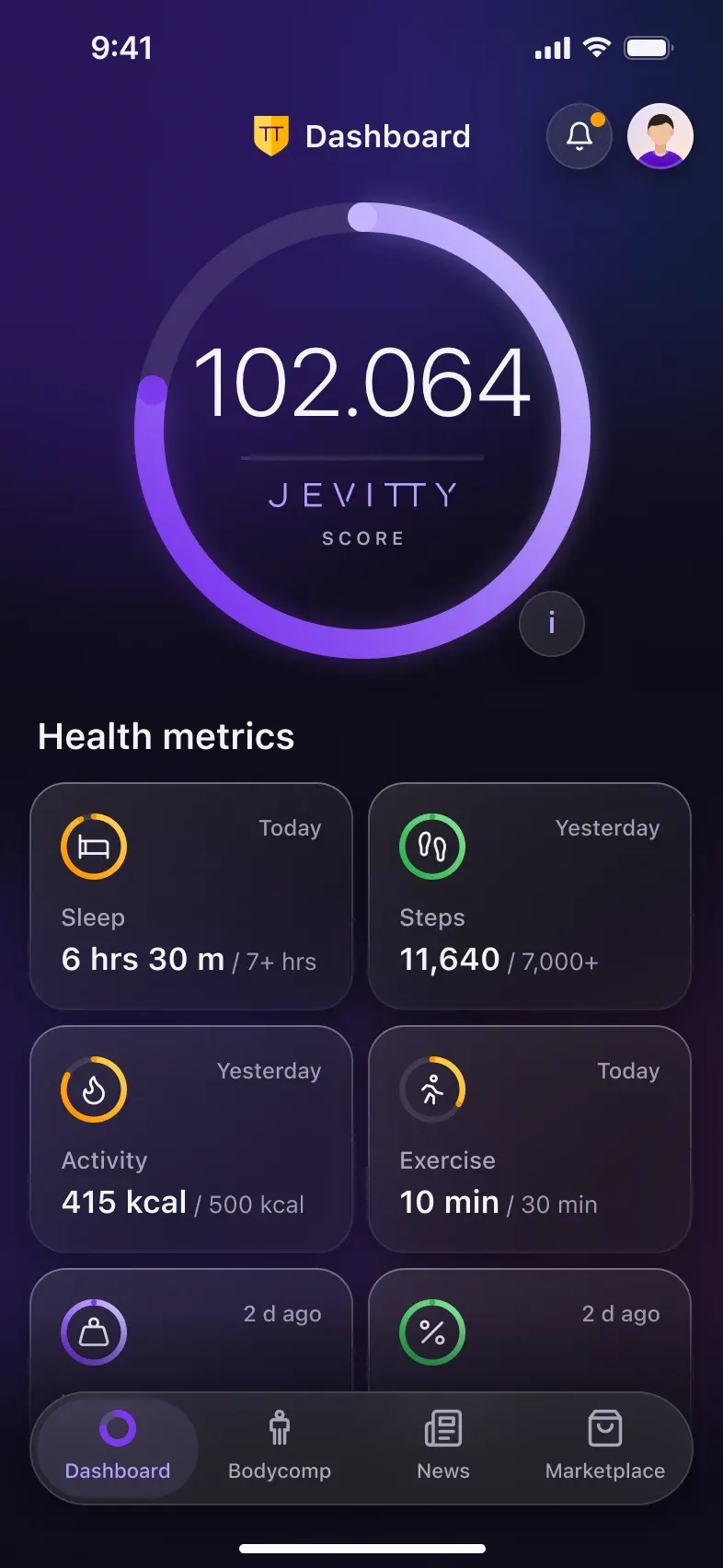
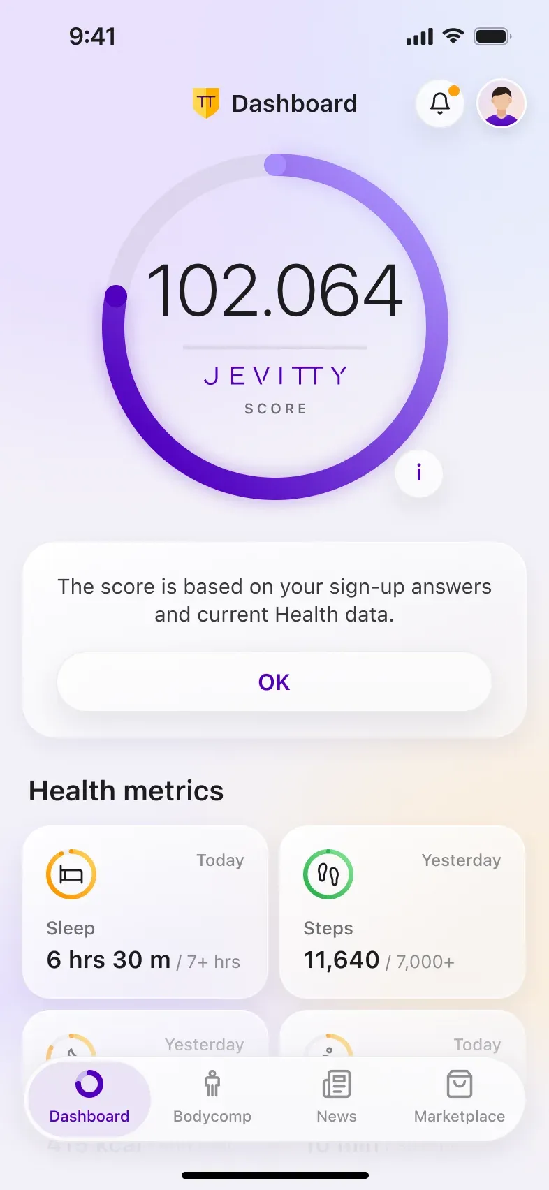
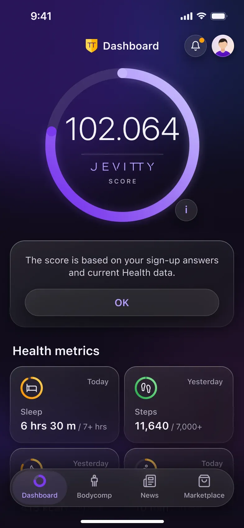
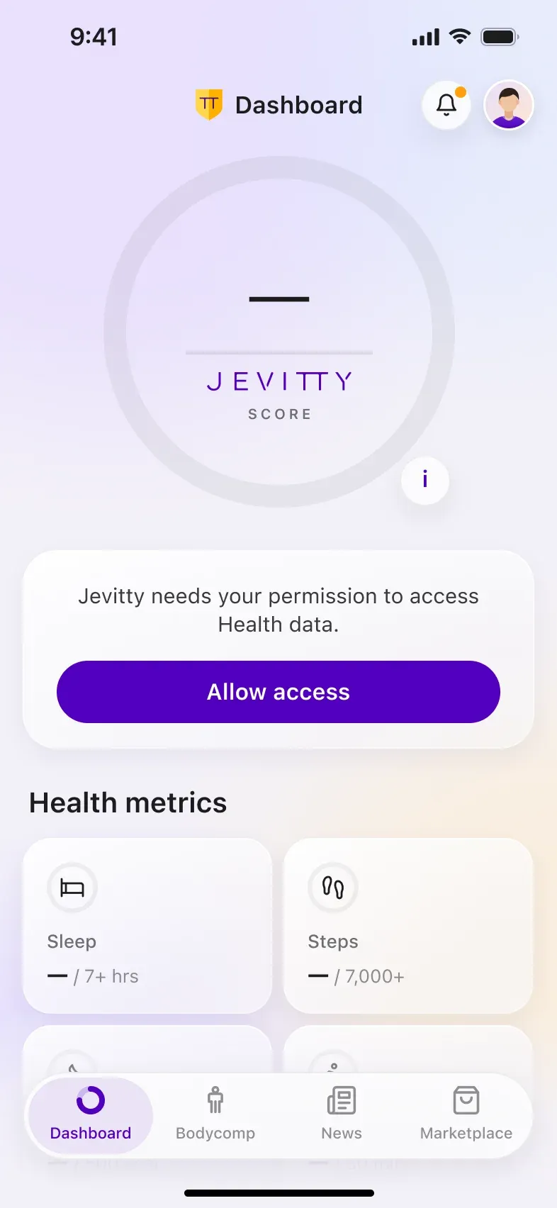
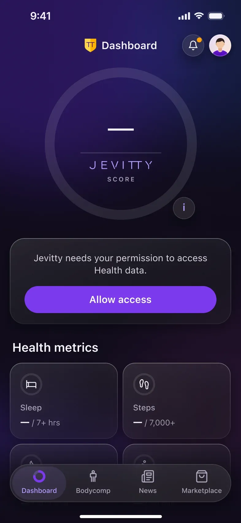
The dashboard keeps its original structure: the Jevitty Score on top and eight health metrics below, each in its own ring.
- The score keeps three decimals, so even small changes feel alive.
- Metrics live on one glass card: bold values, lighter goals.
- Score info and Health access are inline states, not separate screens.
Bodycomp: Medical Imaging in Your Pocket
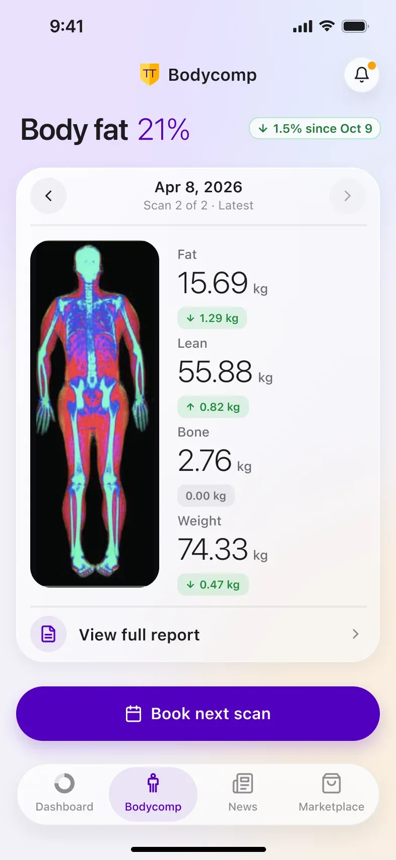
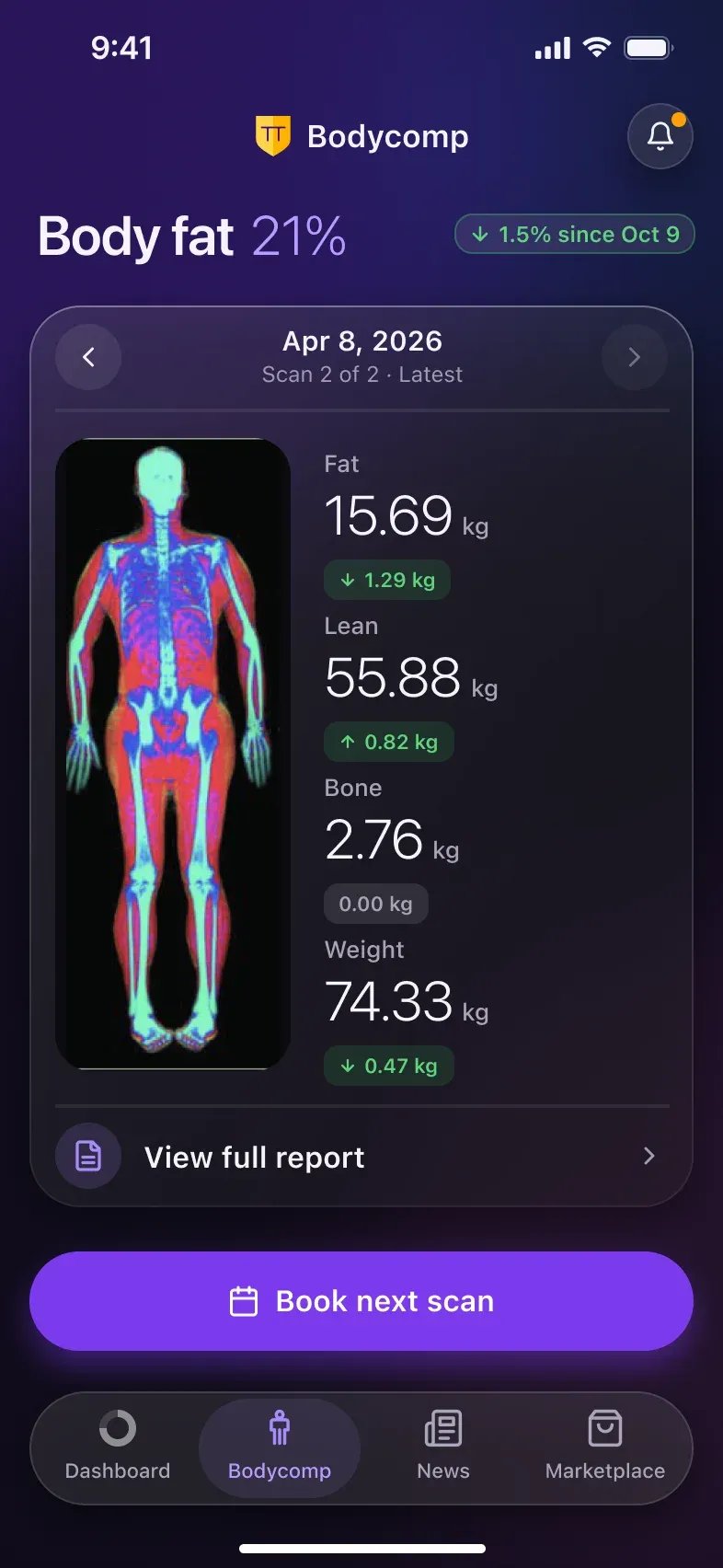
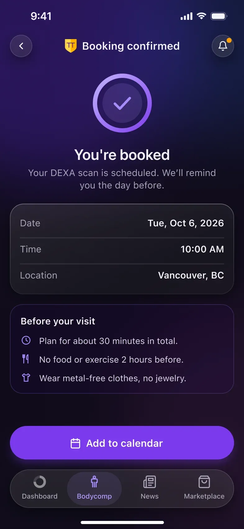
Through a secure REST API with Bodycomp.ca, a DEXA scan clinic in British Columbia, users open their body‑composition reports in the app. The scan stays the hero; the data around it became easier to read:
- Body fat leads the screen, with its change since the last scan.
- Fat, lean, bone and weight sit in their own glass cards next to the scan.
- Changes use colour and arrows: green for a healthy change, grey for no change.
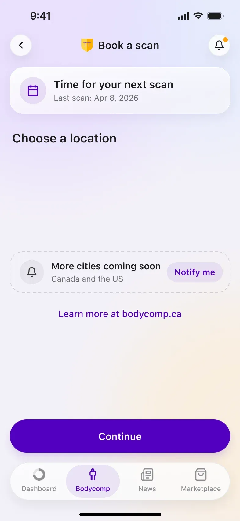
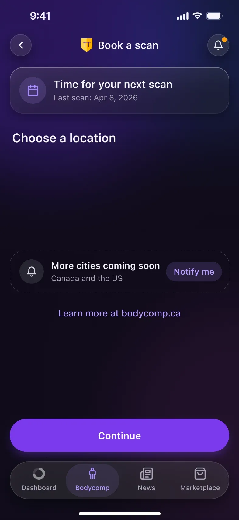
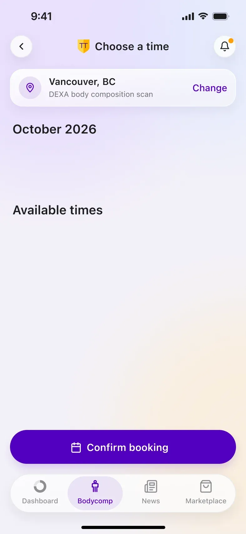
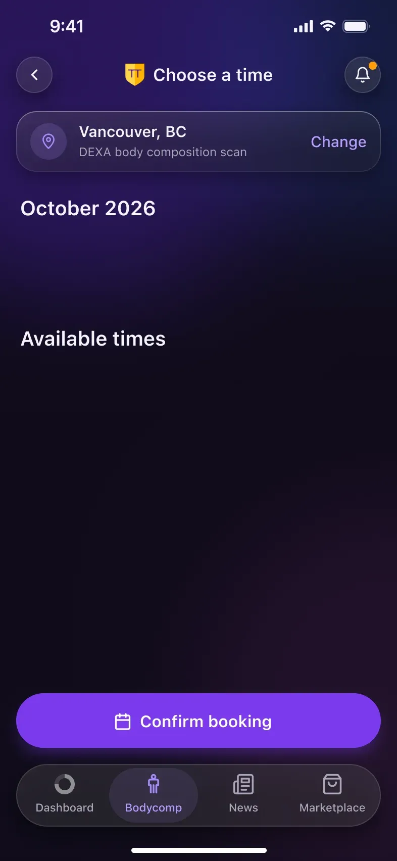
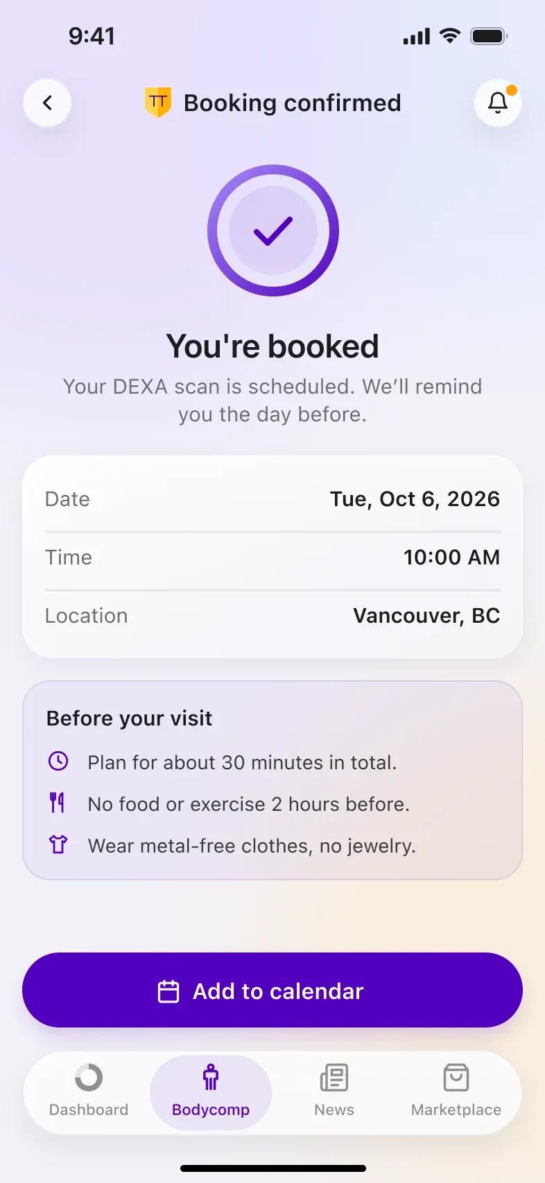
- Booking the next scan is one tap away, closing the loop with the clinic.
Beyond the Score: News, Marketplace and Profile
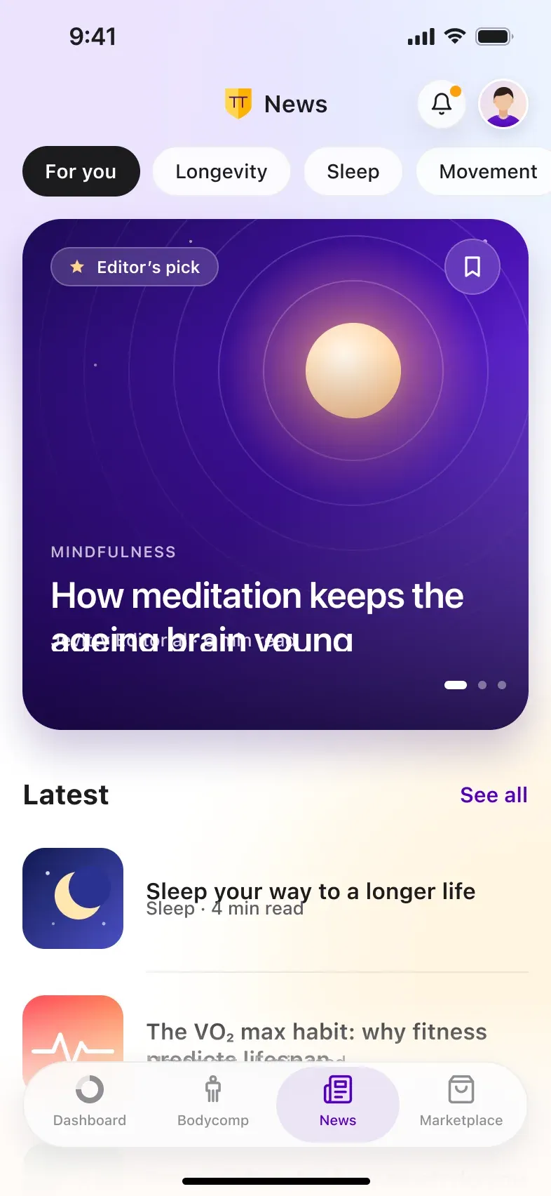
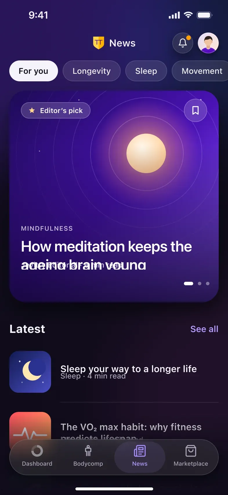
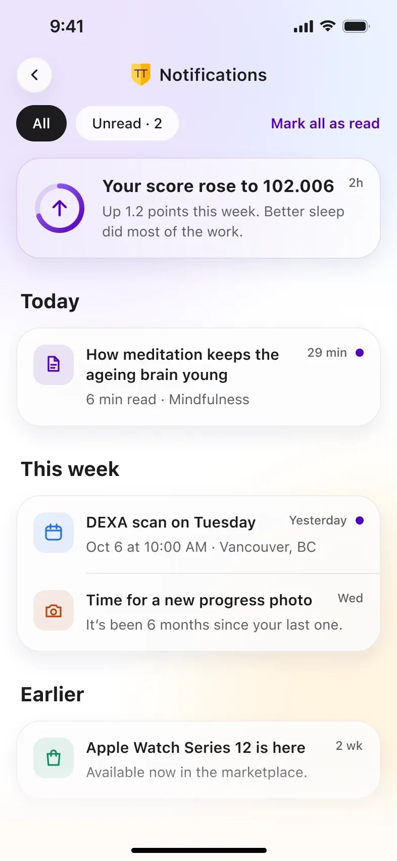
Around the core loop sit the screens that keep people coming back:
- Curated longevity articles and a way to suggest new ones.
- A marketplace of gadgets that feed the score.
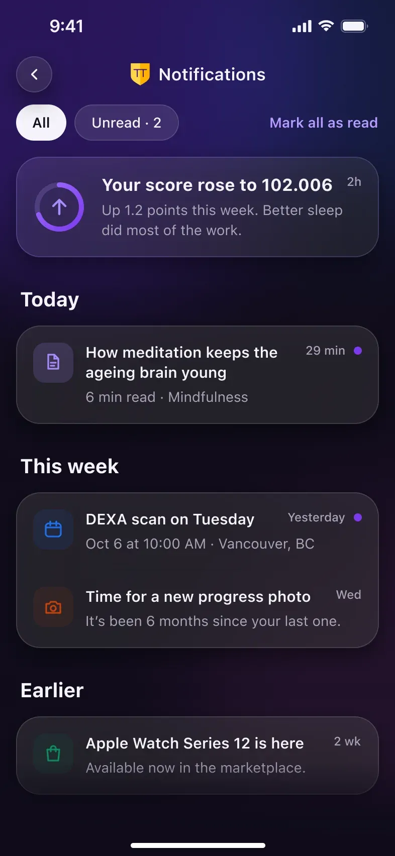
- Notifications that celebrate a higher score instead of just listing events.
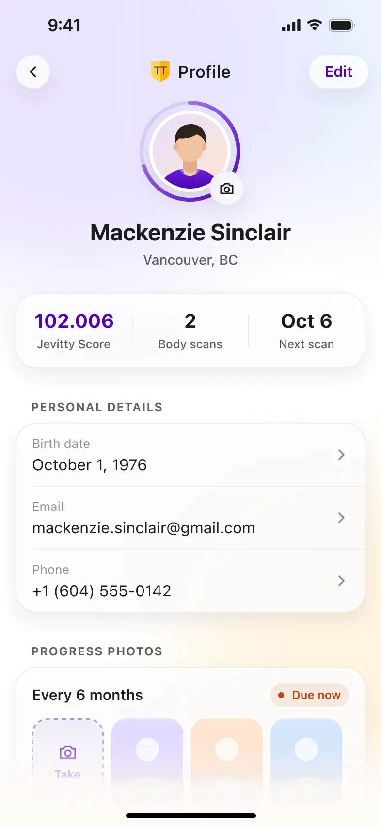
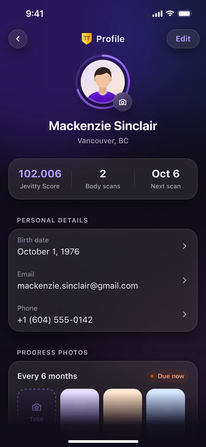
- A profile that keeps questionnaire answers editable, so the score stays honest.
UI Refresh: Same UX, Cleaner Surface
In 2026 I revisited the app for today’s iOS. The flows, the information architecture and the Jevitty circle stayed; the visual layer and the content were brought up to date.
- 18screens redesigned
- 5core patterns rebuilt
- 15icons redrawn
- 4 ptspacing grid
Navigation bar
2022: Solid purple bar with caps title
2026: Transparent bar, glass buttons, same logo and title
Surfaces
2022: White lists with thin dividers
2026: Frosted glass cards on a soft gradient
Buttons
2022: All caps, letter-spaced, square corners
2026: Sentence case, pill-shaped, with direction
Data
2022: Small values, lilac delta chips
2026: Large light numerals, colour-coded deltas
Tab bar
2022: Fixed bar, four tabs
2026: Floating glass capsule, the same four tabs
Design System
One system for iOS, Android, the web app and the marketing site: a 4 pt grid, a single glass material and a compact set of components.
Glass material
One recipe for cards, bars and buttons.
- Fill
- White · 82%
- Blur
- Background · 30
- Stroke
- Black 6% · 1 pt inside
- Shadow
- 0 8 24 · #1A0D40 8%
- Radius
- 20–28 pt
Spacing & radius
Gaps and paddings step by 4 pt.
- 4
- 8
- 12
- 16
- 24
- 32
- 12
- 16
- 22
- 28
- Pill
Layout
393 pt canvas with 16 pt margins.
2 columns · 8 pt gutterComponents
Six building blocks shared by every screen.
- Buttons
- Chips & deltas
- Progress rings
- Tab bar
- Metric card
- Navigation bar
 Profile
Iconography
Outlined, rounded caps, drawn on a 24 pt keyline.
Results
Four outcomes, measured against the original brief.
Clear value proposition
The Jevitty Score turned longevity into one number people can track.
Connected health data
Apple Health, wearables and DEXA scans feed one calm, readable interface.
Purpose-led brand
One shield identity carries across the app, website and social templates.
Apps in production
Native iOS and Android apps and a web app, all built on one design system.
Want to learn more about the process and design decisions?
Let’s talk